Updated my website
8 Comments:
I think it's fab.
By Kristen Painter, at 11:05 AM
2 am? Geez, get some sleep!
By Sandra Ruttan, at 3:42 PM
Very nice website!
By Emma Sanders, at 5:26 PM
Wonderful.
All the right ingredients.
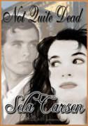
Why am I in love with the heroine on the cover of "Not Quite Dead"?
...Generically pretty...and those sideways-looking, cautious eyes.
The guy doesn't look like a Titanic survivor either...Tribute to your cover artit.
Is that you on the cover, Sela? LOL
It looks great Sela! I didn't see any misspelling.
Thanks for being my extra eyes, y'all. You know how it is. You've read the same thing so many times, you can't even see it anymore. Appreciate the help.
And no, Ivan, but I wish. *gg* I think the Sabine on the cover is one of the rare instances of someone who is genuinely pretty. She's not gorgeous, stunning, handsome, interesting. She's pretty.
Vanessa Hawthorn was my cover artist and she does a lot of "people" covers. The guy on the cover had to grow on me a bit. I find him a little refined for Willem, but he gets the job done!
By Sela Carsen, at 7:48 PM
Site looks great!!!
It looks great! And good luck with the upcoming move, btw.


